Python Visualization
Last updated on 21st April 2026
Visualizing The Supply Chain Network Using Python
The Simudyne SDK is designed for large-scale simulation workloads where the need for performance outweighs the requirement for visualizing the results. Because data is easily exposed and can be pulled into a preferred data science toolkit, it's recommended that users run their simulations and pass the output data to a tool like Python for visualizing the data.
In this example we will provide a sample of how the supply chain network can be visualized on a map and how to map results.
Using Plotly
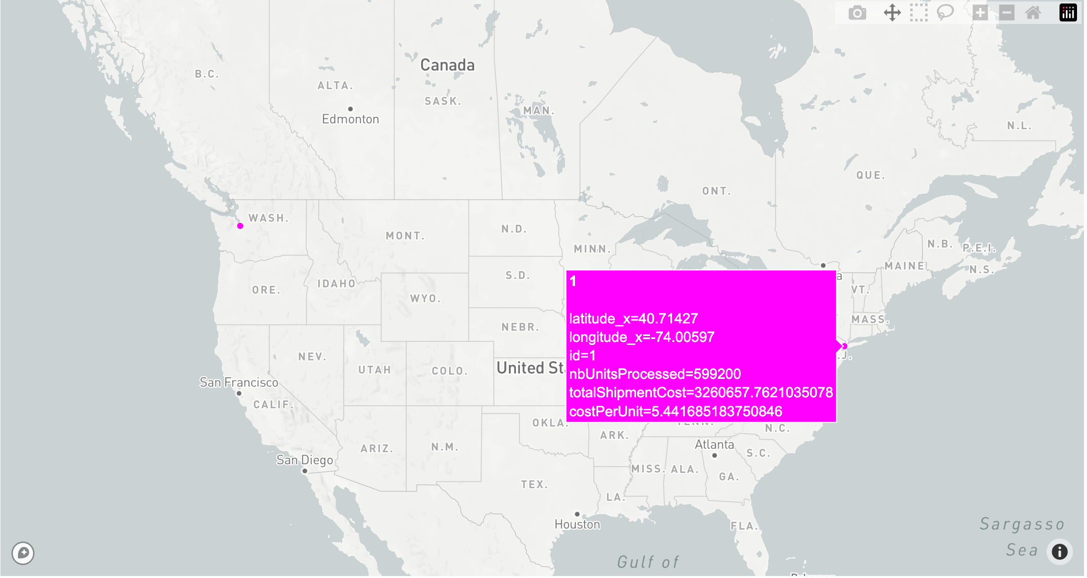
By using plotly we can create an interactive map where hovering over the nodes allows us to visualize information about the facilities in our simulation. Below we use the simple example provided in the supply toolkit and map the 2 facilities. The code below creates the interactive map and makes it possible to hover over the nodes to view facility specific information / results.
import pandas as pd
import plotly.express as px

# Load the data
facilities1 = pd.read_csv('PATH TO YOUR FACILITY INPUTS')
facilities2 = pd.read_csv('PATH TO YOUR FACILITY INPUTS')
data = pd.read_csv('PATH TO RUN DATA')

facilities = pd.concat([facilities1, facilities2])

data = data.rename(columns={'_id': 'id'})

latest_data = data.groupby('id').last().reset_index()

merged_data = facilities.merge(latest_data, on='id', how='left')

mapbox_access_token = 'INSERT YOUR MAPBOX TOKEN HERE'

fig = px.scatter_mapbox(merged_data,
                        lat="latitude_x",
                        lon="longitude_x",
                        hover_name="id",
                        hover_data={
                            'id': True,
                            'latitude_x': True,
                            'longitude_x': True,
                            'nbUnitsProcessed': True,
                            'totalShipmentCost': True,
                            'costPerUnit': True
                        },
                        color_discrete_sequence=["fuchsia"],
                        zoom=3)

fig.update_layout(mapbox_style="light", mapbox_accesstoken=mapbox_access_token)
fig.update_layout(margin={"r":0,"t":0,"l":0,"b":0})
fig.show()
By modifying the code above you can change the fields and add on to the map figure for displaying edges, information along those edges, as well as any customizations that you wish to include.
Below is a screenshot of the visualization that is created from the code above: